


CSSとJavaScriptで影付きの角丸ボックス要素を作る
2006年09月27日-
スポンサード リンク
Transparent custom corners and borders, version 2 | 456 Berea Street
It’s been almost a year and a half since I posted Transparent custom corners and borders, a technique for creating custom corners and borders with optional alpha transparency.
CSSとJavaScriptで影付きの角丸ボックス要素を作る。
次のような2重線と影がついたボックスのサンプルが公開されています。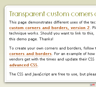
HTMLは次のようにシンプルな形に出来るようです。
<div class="cbb">
 <h1>Transparent custom corners and borders, version 2</h1>
 <p>This page demonstrates different uses of the technique described in the article <a href="http://www.456bereastreet.com/archive/200609/transparent_custom_corners_and_borders_version_2/">Transparent custom corners and borders, version 2</a>. Please read that article for more info on how this technique works. Should you want to link to this, please link to the related article instead of to this demo page. Thanks!</p>
 <p>To create your own corners and borders, follow the instructions in <a href="http://www.456bereastreet.com/archive/200506/customising_custom_corners_and_borders/">Customising custom corners and borders</a>. For an example of how easy doing stuff like this will be once all browser vendors get with the times and update their CSS support, check out <a href="http://www.456bereastreet.com/archive/200509/custom_borders_with_advanced_css/">Custom borders with advanced CSS</a>.</p>
 <p>The CSS and JavaScript are free to use, but please create your own graphics. Thanks!</p>
</div>
デモページのソースを参考に、この仕組みを利用することで、CSSデザインの可能性が広がりそう。
※尚、IEでデモページを見たところ影は表示されないようです。

スポンサード リンク
By.KJ : 2006年09月27日 07:05 
 間違いの指摘をしていただける方はメール、あるいはTwitter/FBでお願いします(クリック)
Advertisements


SITE PROFILE

最新のブログ記事(新着順)
- DarkもLightも自動生成:UI向けカラーパレット生成ツール「Harmonizer」紹介
- AIでフォーム生成できる「Formcn AI」
- ウェブサイトの CSS を解析してくれる「Online CSS Code Quality Analyzer」
- 英文を文鳥に変換するフォント「ぎゅうぎゅう文鳥」
- Tiktok公式のフリーフォント「TikTok Sans」
- React+Tailwindなサイトで使えるUIライブラリ「SmoothUI」
- 15000以上のいい感じの線形アイコン「Lineicons」
- CSSやTailwindでのCSSスニペットライブラリ「CSS Snippets Library」
- AIを使ってサイトマップが作れる「Octopus.do」
- ライブラリ依存のないモーダルオープンライブラリ「Blendy」
- 過去のエントリ
